Painting to Music :3


Hey guyss ^.^


So our last class with Miss Lisa ended :(

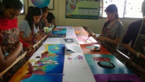
But it was also a really fun experience.


Our canvasses were 50 cm x 60 cm and 60 cm by 90 cm.


Since we were painting to music, we started with the “modern” / “right now” music and then we went on to Classical music.

I was actually really looking forward to this as I really reallyyyy lovee painting haha :D


So when we started with the “modern” music, I used the small canvas to paint. I don’t exactly have a specific reason why, I just felt like painting on the smaller canvas first haha.


Anyways, at that point of time when the music was playing, I actually felt really frustrated and somewhat angry at how things were kind of disorganized :(

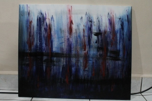
I used dark colours on the canvas as I felt gloomy.

I started with a large brush, dipped it in dark blue and painted in an upwards direction from right to left.

I then decided to add a little black that opposes the blues. So I painted a few black lines, some from left to right, some right to left.

Then I added red to add that little bit of anger.


Here is the final product! :)

IMG_5029

There’s also a little bit of purple at some points to give it a little hint of highlight.


We then moved on to Classical Music!

At this point I felt a little better and was much more happier.

The music definitely helped a lot too.

The classical music started playing and it was a lovely, jumpy tune :)

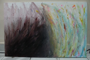
So I started with bright colours on the right side of the canvas.


I dipped my finger in the paint and splashed whites, yellows, light sky blue, bright pink and some bright orange on the canvas.

The music was really bringing out the joyful, jumpy atmosphere.


After a while though, the speakers started playing dark classical music.

At first I wanted to ignore it because I was really liking the joyful atmosphere and I really liked the bright colours on my canvas.

Then I thought, “This activity is meant to be a paint to music activity, so obviously we should paint TO the music, right?”

SIGH.

So then I decided to follow the flow music.


I started using dark colours on my canvas and painted the left side of my canvas with blacks, dark purple and dark red.


This is how it turned out :)

IMG_5033

It was meant to feel like the dark and happy forces were opposing each other, but I think the effect was not fully achieved due to the direction of the paint on each side.

If the direction I was painting on both sides of the canvas mirrored each other, it would’ve better achieved the opposing effect.


Owells.


It was a great experience anyhow :D


I really enjoyed painting to music and painting with my classmates.

It was also really fun to see everyone with their own art styles.

You could clearly see everyone had their own style of painting and I really loved see-ing how different everyone felt about the types of music played.


Oh, and I guess this would also be my last post on this blog :(

But if you want updates on what I’m doing, just go to my main blog! :)

Link is in the “About Me” tab :)


Lastly I would love to thank Miss Lisa for everything she has taught me throughout my whole foundation year.

I am honestly more aware of design principles now than I was when I first started the course. :)


I am truly grateful :’)


Signing off,

Annabel.


Monogram and Batik : Presentation :)

Hey guyssss :D


So today we presented our monogram and batik works! ^.^

Here are some photos from our monogram presentation.

DSC_0315

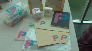
Here’s Fauza’s monogram. Her monogram is for her initials F and P :)

Here's Lisa's monogram. Initials : LV

Here’s Lisa’s monogram. Initials : LV

Here's Ailsa's monogram! Which I really love. ^.^ Initials :AA

Here’s Ailsa’s monogram! Which I really love. ^.^ Initials :AA


I didn’t take anymore photos of my other classmates’ monograms but just for your information they were all really clever and pretty :)

DSC_0313

And here’s mine. I used my full name for my monogram. Initials : ATSH

And now on to the Batik Presentation! :)

DSC_0317

This is how our batik paintings turned out. And now you know how I look in real life. hahaha. I wish I could’ve worn my turquoise to match my batik painting though. Owells.

DSC_0323

Here’s a photo of the Batik Painting of me just cause ^.^

I honestly think it wasn’t the best Batik painting ever, but I’m going to comfort myself with the fact that it was my first time doing Batik painting and I would do better next time. hahaha.

Oh, and today was also sort of our last “official” class with Miss Lisa :(

We’re going to have one last unofficial class with her though.

WE’RE GOING TO PAINT TO MUSIC!

We can choose our own medium and bring them on that day and we’re going to paint on 2×3 feet canvases!

I honestly cannot wait! :D

Wheeeeeee! ^.^

Annabel. :)
Batik : At the factory! :)

Hey guysss :D


So we went to the Batik factory and were taught how to paint on batik!

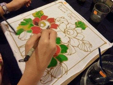
They first use wax on the cloth to draw.

They then later paint on the cloth and the wax prevents the paint from spreading out of areas that you don’t want the paint on.


I think you’re probably finding this hard to understand, so I shall show you a picture.

The brown stuff is the wax that you use to draw your design :) When you paint on the fabric, the paint won’t spread into other areas :D


Before going to the factory, Jamie printed the designs on A3 paper so that it’ll be easier for us to trace out our designs on the fabric :)

IMG-20131130-WA0000


Here’s a photo of my group members and I painting our batik pieces at the factory! ^.^

WP_20131129_013

The ones on the right are us :) The ones on the left are Lisa, Afiqah, Mathuri and Kashwini’s work :D


Our work will be properly dried, washed, framed and sent to our campus :)


Annabel. ^.^
Batik : Ideas! :)

Hey guysss :)


We have a new assignment to work on! ^.^

Silk-painting, which is known here locally as “Batik” is what we’re going to be doing!

We were told to sketch out some ideas for what we’re going to paint on the batik.

BUT FIRST!

Group members :)

We will be working in groups on this assignment.

My group members are Ching Hsin, Jamie and Zainah ^.^


We discussed and sketched about ideas, but UNFORTUNATELY I LEFT MY FOOLSCAP BOOK WHICH WE SKETCHED THE IDEAS ON IN A CLASSROOM.

I NEED TO STOP BEING CARELESS :(

I wish I could show you guys D:

Meh. This sucks.


Anyways, I guess I’ll show you our finalised idea!

IMG-20131129-WA0001

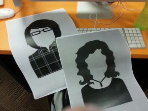
Minimalistic graphic interpretations of ourrselves! :D

I just realised you guys have never actually seen my actual face hahaha.

Guess you wouldn’t know which is me YET.

IMG-20131129-WA0005

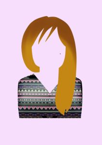
This is Ching Hsin :) Who always has her hair on one side and loves aztec designs.

IMG-20131129-WA0006

This is Jamie, who has cute short hair, wears black rimmed glasses and loves wearing checkered clothing. ^.^

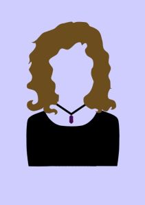
This is Zainah, who has curly hair, wears black and loves her dark purple stone-like necklace :)

This is Zainah, who has curly hair, wears black and loves her dark purple stone-like necklace :)

Andddd, this is me, Annabel, haha. Yup, I have short hair and I'm known for always wearing hoodies. (I have about 4 of them btw haha)

Andddd, this is me, Annabel, haha. Yup, I have short hair and I’m known for always wearing hoodies. (I have about 4 of them btw haha)


Guess you guys should be looking forward to our final “Batik” paintings!


Annabel. ^.^
 

“What’s Your Square?” Exhibition at the Coda Gallery ^.^

Hey guysss :)


Remember my “What’s Your Square?” assignment?

We had an actual exhibition for it!

Our artworks were combined with the artworks from our juniors :)

We have a little gallery on campus and we usually display our artworks there ^.^

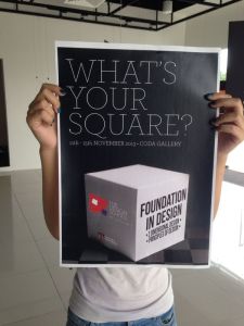
And here’s the poster for the exhibition! :D

The poster (Designed by Hidayah, our classmate with the help of Miss Lisa!) ^.^

The poster (Designed by Hidayah, our classmate, with the help of Miss Lisa!) ^.^

1459992_695528220458387_1274505419_n

Here’s a little look at our gallery from the top :)


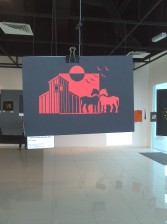
And here’s mine hanging from a piece of wire, secured by a clip! :)

IMG_20131112_171241

Horses.

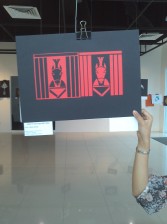
IMG_20131112_171348

Trojan Horses. (That’s Fauza helping me hold it so I can take a photo. Thanks Fauza ^.^)


I’m sorry I don’t have many photos of the exhibition :(

I wish I could’ve taken more.

Owells.


Annabel.
Monogram : Painting it on items! :D

Hey guysss :)


So now that I have my stencils, it’s time to paint them on things! ^.^

I prepared 6 items to paint on.

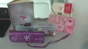
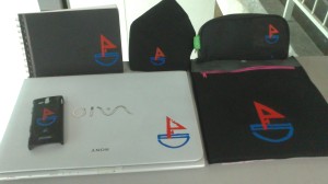
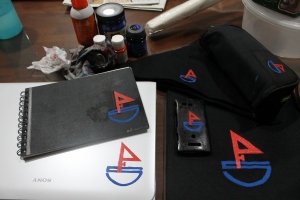
My six items are : My pencilbox, my laptop, a little tote bag, a bandanna, a sketchbook and my phone cover.

Most of the items are my personal belongings as I wanted to make my items and the monogram my own.


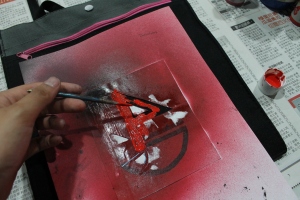
Here are some work in progress photos! :D

Phone cover first stencil done :)

IMG_5000

Painting the second stencil on the tote bag ^.^

IMG_5001

All the items done and ready to go :)

I am honestly not really satisfied with some of the monograms as some were smudged and messy :(

But I am happy with how everything turned out ^.^

And I also noticed something I didn’t realise when I chose the things I wanted to stencil my monograms on.

Most of the items I chose are black except my laptop.

Oh and just so you didn’t know, black is my favourite colour ^.^


Annabel.
Monogram : Stencil Making! :)

Hey guysss ^.^

I made stencils for my monograms!

Initially I wanted to make 4 different sizes for my monogram, but I one of the sizes was really small, so I trashed that idea.

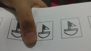
Here, I’ll show you how small it is.

DSC_0319

It’s the size of half my thumb!


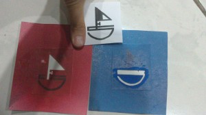
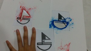
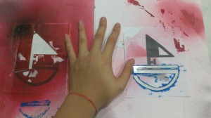
Here are the 3 other sizes that I made into stencils! :)

Oyeah, I had to make double stencils by the way.

Meaning one for the sail, which is in red, and another for the boat, which is in blue ^.^

The first one is the size of my thumb :D

The first one is the size of my thumb :D

The second stencil is the size of my pointer finger :)

The second stencil is the size of my pointer finger :) (and yes, I have bony fingers haha)

And the last stencil is about the size of my palm! ^.^

And the last stencil is about the size of my palm! ^.^


Annabel. :)


Monogram : Proportion and Colour.


Hey guyss ^.^


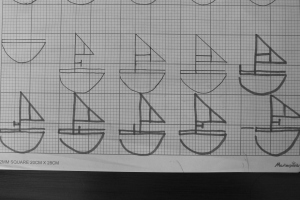
So I experimented on the proportion and colour for my monogram :)


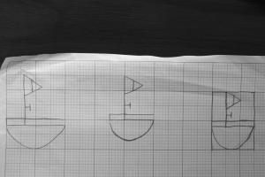
Honestly the proportion of my first few sketches were not really successful.

IMG_4287


But the more I tried the more it looked better.

IMG_4288


More experiments.

IMG_4289


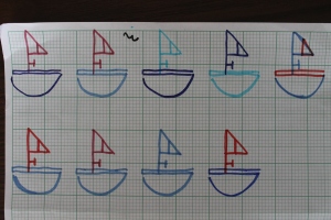
For the colour though, I first tried on different colours.

IMG_4290


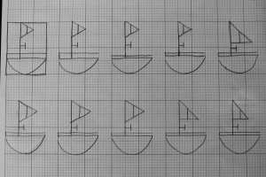
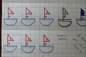
I then narrowed down to two types of colour schemes. I’m not sure if you can see the difference between the ones on the top and the ones on the bottom row. The ones on the top row have a darker red compared to the ones in the bottom row.

IMG_4291


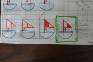
After showing them to Miss Lisa and asking her which colour scheme was better, she decided on the lighter red. She also suggested that I changed the proportion of the flag a little and also to colour in one part of the flag.

IMG_4292

So yeah. The second last monogram with the left side of it’s flag coloured in is my final monogram ^.^


In our next class we are going to make the stencils! 

We also have to decide on 6 items to print our monograms on.


*excited :D


Annabel.


Monogram : Inspirations II


Hey guyssss :D


Sooo, besides the inspirations I showed you before, I found two new inspirations from a book borrowed from the uni’s library.


Here’s the first : 


IMG_4282

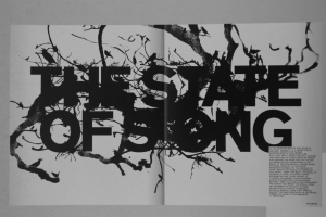
What caught my attention in this particular typography is how it seems so messy but yet it perfectly suits the eye.

It doesn’t come off as too cluttered, it actually makes it seem simple.

When simple and messy work together, it immediately catches my attention.

Our brain may not process the words immediately but since our brain likes a challenge once in a while, the reader would actually stop to decipher the text before moving on.

And that, is how you catch someones attention :D


Second new inspiration :


IMG_4283

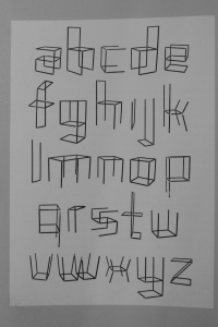
This ones goes a little more to the interior design aspect.

The letter above are all made from metal welded together.

The thing that interests me when it came to this was how the letters of the alphabet were all just made from welding metal together and nothing else. 

It’s that simple.

Another thing that excited me about this was the possibility of actually furnishing a whole building with just letter of the alphabet.

Wouldn’t that be cool?

A whole building with only alphabetical furniture!

It could be a theme for an interior project haha :D


That’s all for this post!


New developments on the monogram will be in the next post ^.^


Annabel.


Monogram : Inspirations.
 

Hey guys! :D


We didn’t sketch on Monday :C

Owells.


But I’ll show you some very interesting and inspiring stuff I found.

First, I’ll show you the typography related ones.

A

I found the strike across the “A” interesting because it gave the letter a sense of movement.

A2

The way the letter is shaped, gave me the feeling that the letter is thin and claustrophobic hahaha.

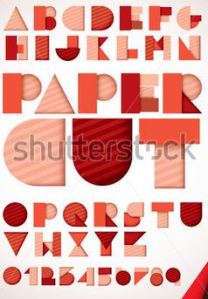
It's really interesting how all the letters are made out of basic shapes.

It’s really interesting how all the letters are made out of basic shapes.


Now for the one’s that are unrelated but are really interesting.

JUST. PERFECT. I. CANNOT.

JUST. PERFECT. I. CANNOT.

It speaks for itself doesn't it? HAHAHA.

It speaks for itself doesn’t it? HAHAHA.


And now for some monograms that I found online (THESE ARE NOT MINE AND I DO NOT CLAIM OWNERSHIP FOR THEM).

m4

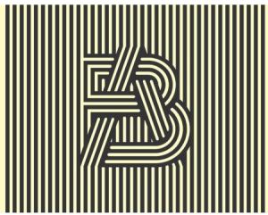
AB. (The stripes are just. so good.)

n1

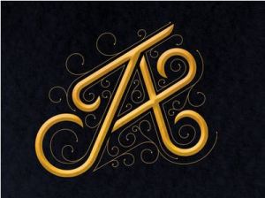
JA. (Simple and full of movement.)

AT. (Music related. PERFECT.)

AT. (Music related. PERFECT.)

AT (Another perfect one OMG.)

AT. (Another perfect one OMG.)


Sooo, during class, we had this activity where we had to narrow down on one (oh, I had more btw, I’m just lazy to put everything on here. HEH.) and then sort of explain the reasons why we like it.

Andd, guess which one I chose?


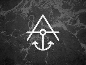
THIS.

THIS.

Sooo, why do I like it? 

Okay, number one, it is nautical. You have no idea how nautical stuff interests me.

I haven’t had much experience sailing or being in the sea, but my best friend and I had always wanted to get our sailing licenses and sail the world.

Besides, I think the background for this monogram was just brilliant. It fits so well with the monogram.

Imagine this monogram put on a plain solid-coloured background.

It wouldn’t be as attractive as this background would it?

Now let’s talk about the sea. HEH.

Have you ever floated on your back in the water and just stayed there?

You ears would be underwater and the sound of the water just calms you and all you want to do is just lie there and never get out of the water.

Please don’t tell me I’m not right.

OH C’MON.

Anyways, let’s talk about the monogram now.

What I really like about it is that it speaks to the audience.

It’s so straightforward and simple. There’s nothing complicated, and it’s easily understandable / interpreted.

SOOO YEAH. 

That is why I chose that particular inspiration out of the others.

Anyways, class tomorrow should be interesting.

I think we’re going to start sketching :D

Annabel.